> ## Documentation Index
> Fetch the complete documentation index at: https://lightdash-mintlify-a1dca41c.mintlify.site/llms.txt
> Use this file to discover all available pages before exploring further.
# Interacting with dashboards
> Filter, re-zoom, cross-filter, and drill into the charts on a dashboard without editing them
Everything on this page is something a viewer can do to a dashboard without editing it: narrow it with filters, change the time granularity of its charts, filter the whole dashboard by clicking a value in one chart, look at the rows behind a data point, and break a metric out by a dimension.
## Filter the dashboard
Filters sit at the top of a dashboard and change the data in the tiles below. Click a filter to change its value, or click `Add filter` to add your own — the filters you add yourself are temporary, so nobody else's view changes.
Editors can save filters into the dashboard, require viewers to pick a value before anything loads, and control which tiles each filter reaches. See [dashboard filters](/explore/dashboards/filter) for all of it.
## Change the date granularity
Date zoom changes the granularity of time-based charts — Day, Week, Month, and so on — without editing them. Editors set up controls that govern every chart at once, or just a chosen subset.
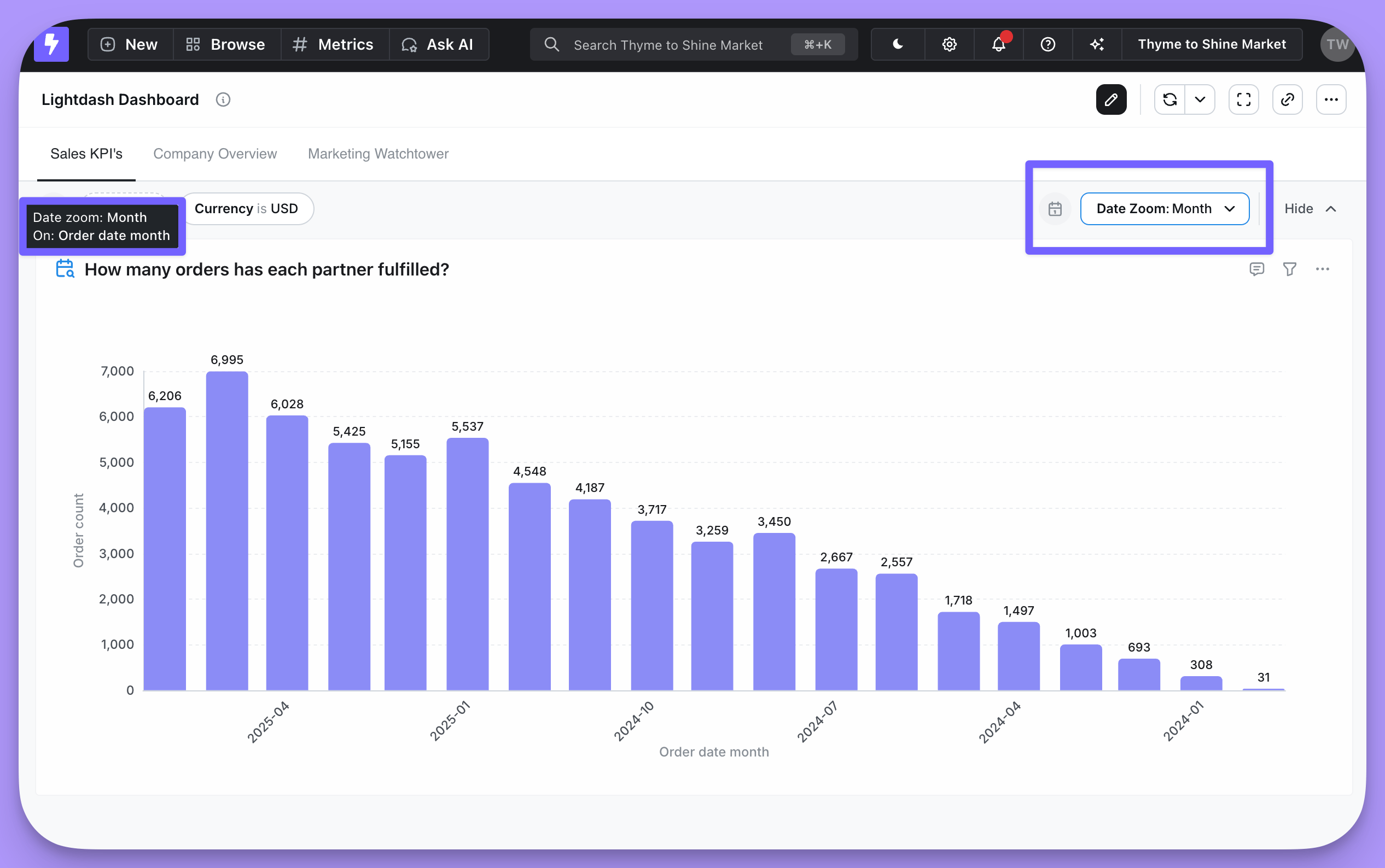 See [date zoom](/explore/dashboards/date-zoom) for creating controls, configuring granularities, and setting defaults.
## Cross-filtering from a chart
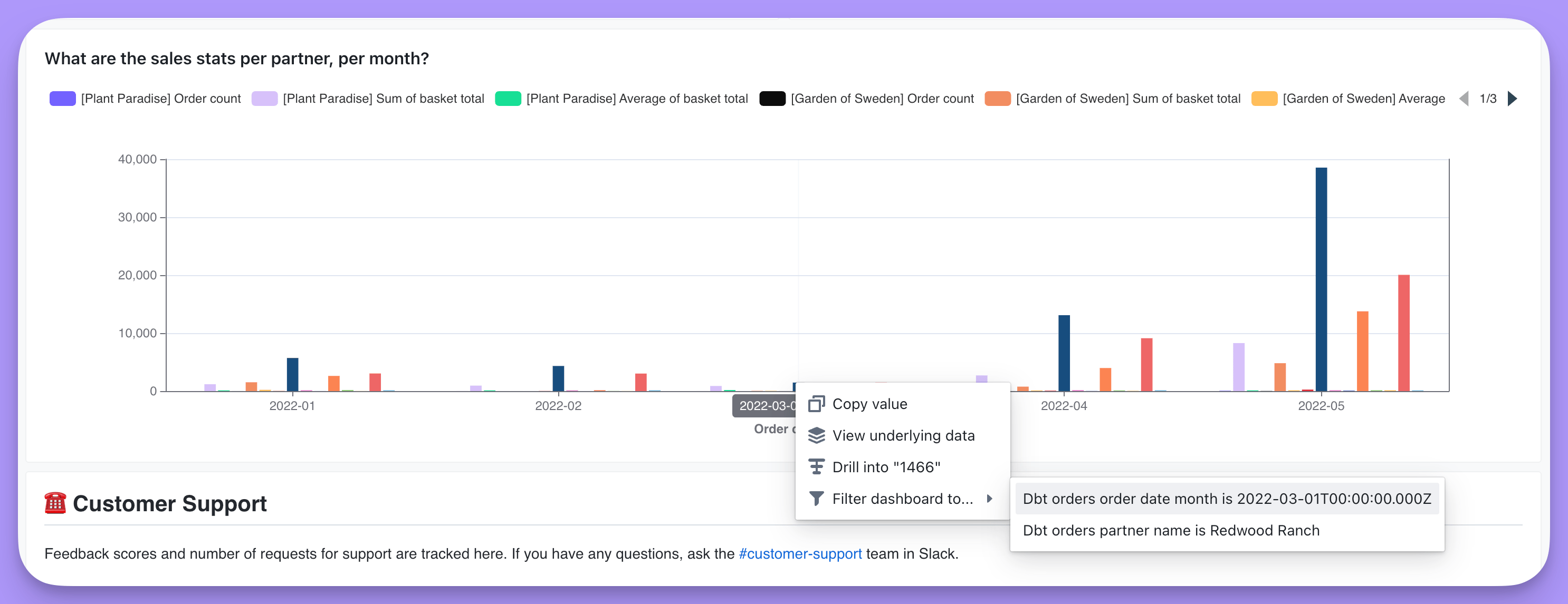
Clicking a value in a chart — a bar in a bar chart, say — lets you filter on that value and update every other relevant chart in the dashboard. Filtering a dashboard from one of its own charts is called cross-filtering.
See [date zoom](/explore/dashboards/date-zoom) for creating controls, configuring granularities, and setting defaults.
## Cross-filtering from a chart
Clicking a value in a chart — a bar in a bar chart, say — lets you filter on that value and update every other relevant chart in the dashboard. Filtering a dashboard from one of its own charts is called cross-filtering.
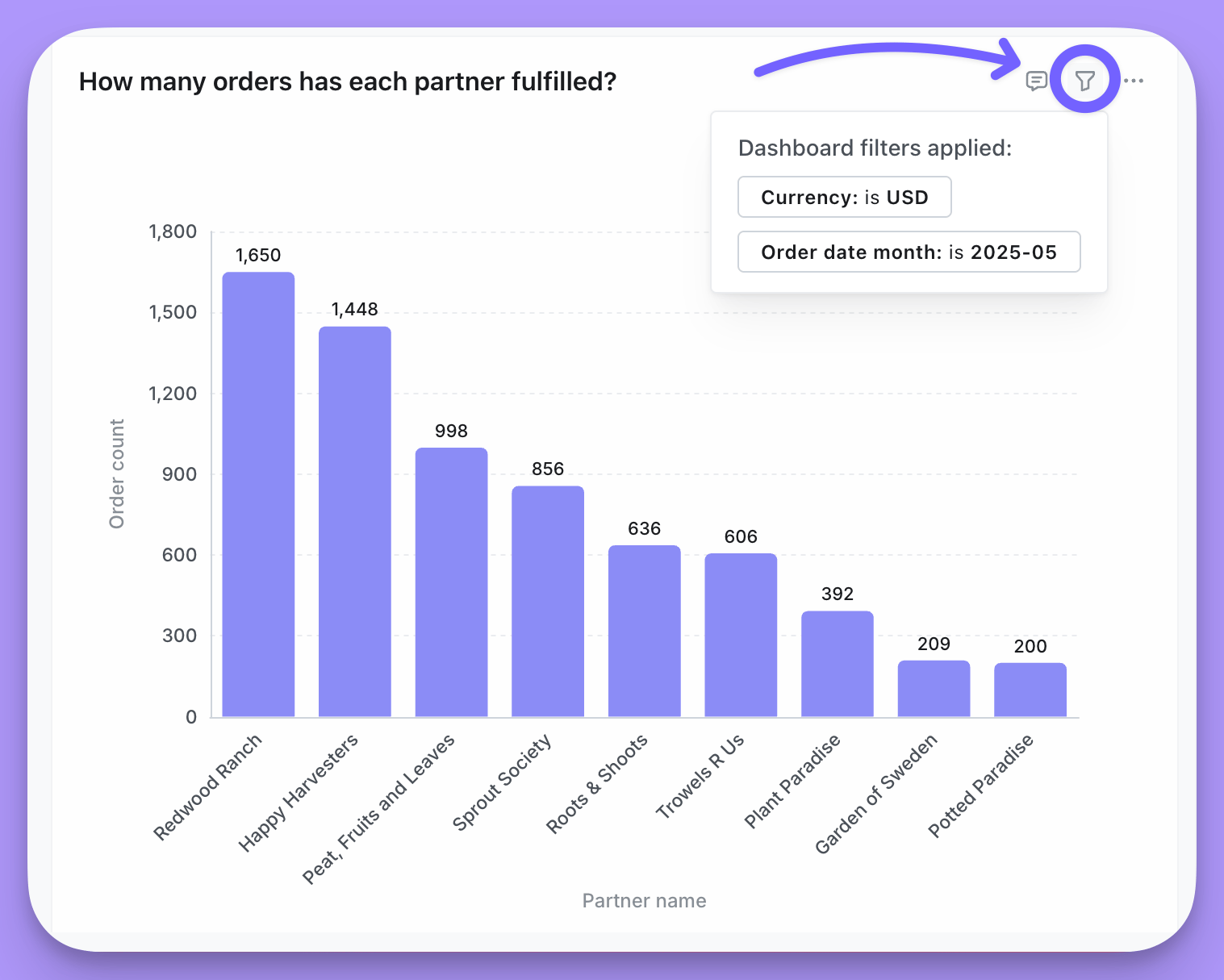
 Every tile in the dashboard that has the filtered field is filtered to the value you picked. Hover over a tile and then over the funnel icon to see which filter it got.
 A cross-filter is a [temporary filter](/explore/dashboards/filter#temporary-filters): it belongs to your session until you save it into the dashboard.
## View underlying data
Click any point on a chart or any cell in a results table and pick **View underlying data** in the action menu to see the records that make up that number.
For example, clicking the bar for a month in a `Sales stats per partner, per month` chart shows every row in the underlying table that adds up to that month's total.
A cross-filter is a [temporary filter](/explore/dashboards/filter#temporary-filters): it belongs to your session until you save it into the dashboard.
## View underlying data
Click any point on a chart or any cell in a results table and pick **View underlying data** in the action menu to see the records that make up that number.
For example, clicking the bar for a month in a `Sales stats per partner, per month` chart shows every row in the underlying table that adds up to that month's total.
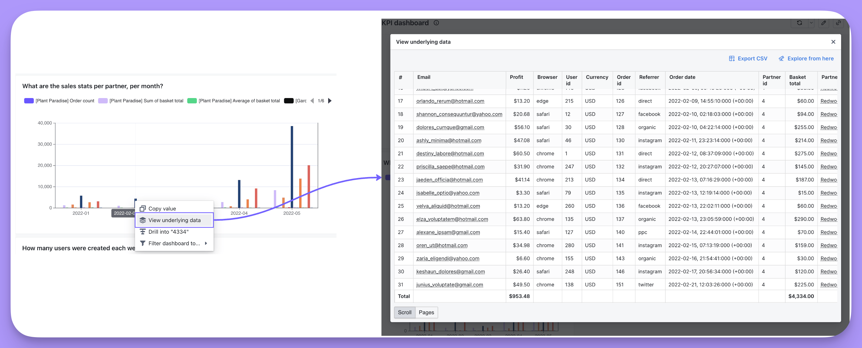 From there you can export the rows as a CSV, or click **Explore from here** to open [the Explore view](/explore/explore-view) with that underlying data as the starting point.
### Choosing which fields appear
By default, underlying data shows every dimension from the table, plus every field from any joined table included in your results. To show a narrower set instead, specify the fields on the metric in your table's `.yml` file — see [show underlying values](/semantic-layer/metrics#show-underlying-values) in the metrics reference.
Those same fields are pre-selected when someone clicks **Explore from here** from the underlying data table, so they don't land in an empty results table.
## Drill into a metric
Drilling breaks a metric out by a dimension — total revenue segmented by product type, for example — so you can see where a number came from. **Drill into** works on metrics only, not on dimensions or table calculations.
Take a chart of **Sum of basket total** per partner, per month, with a conspicuous spike in sales for one partner in May. To find out why, click the data point and then click **Drill into** in the action menu.
From there you can export the rows as a CSV, or click **Explore from here** to open [the Explore view](/explore/explore-view) with that underlying data as the starting point.
### Choosing which fields appear
By default, underlying data shows every dimension from the table, plus every field from any joined table included in your results. To show a narrower set instead, specify the fields on the metric in your table's `.yml` file — see [show underlying values](/semantic-layer/metrics#show-underlying-values) in the metrics reference.
Those same fields are pre-selected when someone clicks **Explore from here** from the underlying data table, so they don't land in an empty results table.
## Drill into a metric
Drilling breaks a metric out by a dimension — total revenue segmented by product type, for example — so you can see where a number came from. **Drill into** works on metrics only, not on dimensions or table calculations.
Take a chart of **Sum of basket total** per partner, per month, with a conspicuous spike in sales for one partner in May. To find out why, click the data point and then click **Drill into** in the action menu.
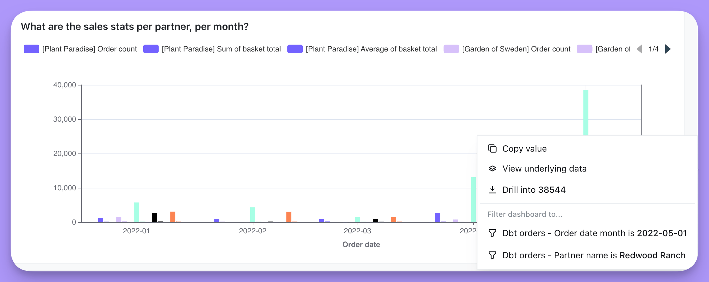 Then pick the dimension to segment the metric by. Here that's **Shipping country**, to see where the orders came from.
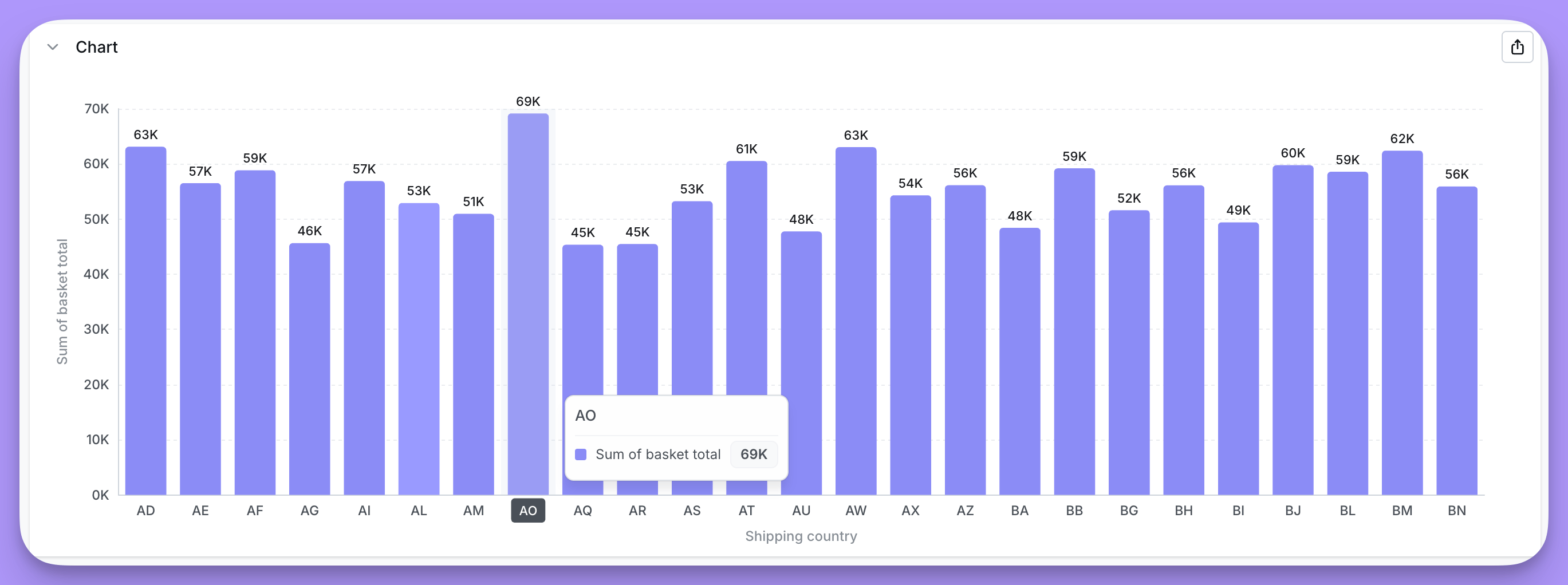
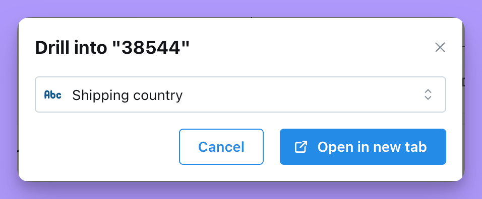 Click **Open in new tab** for a chart of the metric grouped by `Shipping country`, which shows where the spike came from.